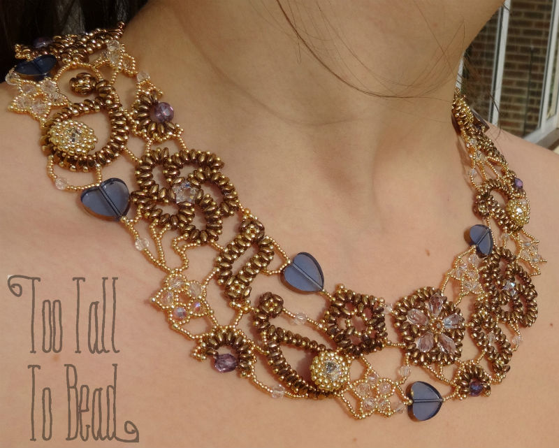
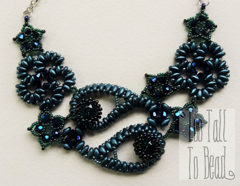
I have recently been making a series of pieces called Paisley Lace, which were initially inspired by a piece if pink appliqué. I applied this to a top, and then made a necklace to match.
Whilst making the current batch I started to think about my colour choices. Usually, when I am beading something, I like to choose contrasting colours to hi-light the texture of the design. Not so in this case.
Paisley lace consists of a sequence of distinct elements originally from paisley fabric designs see more . The elements are rosette, paisley, pinwheel, star, leaf and fan. All of which can be seen in my Paisley Lace collar, that I made last year.
The current paisley lace designs are made of a selection of colours that are quite close together, this works because all of the elements are of distinctive shapes.
So given that all the parts are going to be of a similar colour, how to bring interest?
If you look carefully you find that each type of bead is actually a different colour, even the chatons are turquoise (not obvious from that picture!), and the seed beads between the super duo beads are metallic sea green. Due to the small size of the beads, you can vary the colour much more than you might think, as you eye blends the colours back together. Also, of course it is impossible to find beads in exactly the same colour anyway! This method draws your eye into the piece, making it more interesting.
I need a name for this effect, analogous colours, tonal, ombré, but I have settled on ‘Tone on Tone’ (thanks to Aruna Mohan via FB).
You have to give an effect a name, so that you remember what it is next time!


